
Link to Animation:
MODELING:
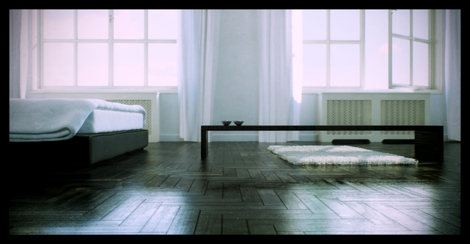
With the modeling we tried to do something different than what the usual commercial architectural visualization task requires. The main goal was to create a special atmosphere for the room. After agreeing upon the style I sketched down the proportions of the room. The base model was created from boxes within 3ds Max. It was then subdivided and the holes for the windows were cut. From the beginning the emphasis was on the lighting and posteffects, so after creating a basic floor material I already started experimenting with the lights. By changing the Sun's position I wanted to find the ideal angle of incidence for the main light which has already set the mood for the composition. When the lighting seemed to be acceptable I made one or two test composites in Photoshop. And then I finished the rest of the modeling (doors, windows, switches, radiators, lamps) and also used some furniture from existing model libraries.
TEXTURING & SHADING:
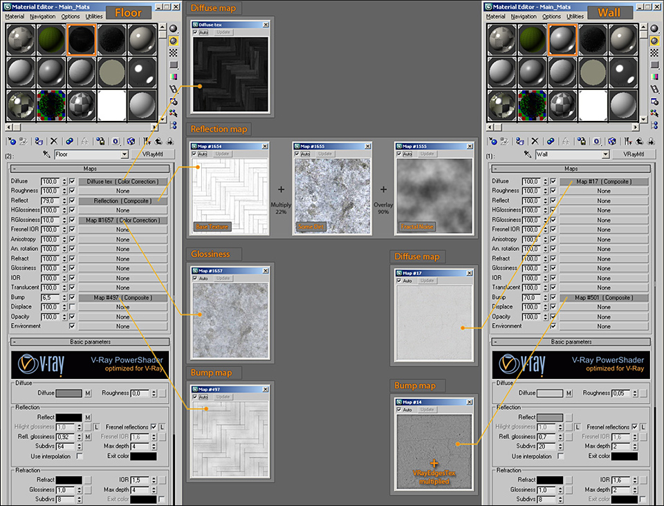
The hardest problem to solve was creating the material for the wooden floor because the bump had to be very sharp and the glossy reflections had to be noiseless even during animation. I could only achieve this by lowering the blur for the bump texture and raising the samplecount for the glossy reflections. This took quite a lot of time since I had to find a setup that wasn't noisy but rendertimes were still taken into consideration. It was important that the material of the floor shouldn't look too homogeneous. I managed to do this by putting some fractal noise into the bump channel and by using a texture inside the glossy channel. This made the surface of the wooden floor slightly bumpy and it also looked more worn. The reflection channel got some colored dirt texture that made the surface a bit more colorful.
The shader for the wall was not overcomplicated. I only used the diffuse and bump channels and it also got a bit roughness to look more porous. The bumps needed a composite map which had a VRayEdgesTex map on the top to make the edges more rounded (it's the same as the round corners in Mental Ray).
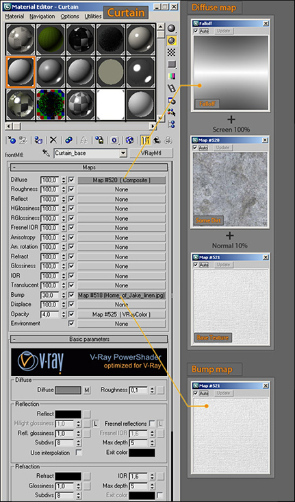
The material for the curtains was based on a VRay2Sided material that had some slightly transparent VRaymtl in it. By putting some falloff map into the diffuse channel I could replicate the fuzzy surface of the textile. The holes on the radiators surface were done by a texture in the opacity channel which was also blurred and used for the bump channel so that the edges of the holes looked more rounded and more spatial.
LIGHTING:
The basis for the daytime lighting were the area lights in the windows. The color and intesity of these lights were controlled by a Dome type VRaylight. I also used a VRaySun and two fill lights. With both the daytime and night lighting setup it was important that the raw renders should not be too contrasted. A non-contrasted image is easier to manipulate in post.
For the night lighting I kept the area light in the windows because they set a mood for an undirect lighting. I only changed their color to blue. Of course I kept the fill lights to light up the darker corners of the room. All the night lamps used sphere typed VRaylights and the Moon was simulated by small intensity light blue spotlight. The tranclucent materials of the lamps were controlled by VRaylights(spheres) that excluded other elements in the scene.
For the night lighting I kept the area light in the windows because they set a mood for an undirect lighting. I only changed their color to blue. Of course I kept the fill lights to light up the darker corners of the room. All the night lamps used sphere typed VRaylights and the Moon was simulated by small intensity light blue spotlight. The tranclucent materials of the lamps were controlled by VRaylights(spheres) that excluded other elements in the scene.
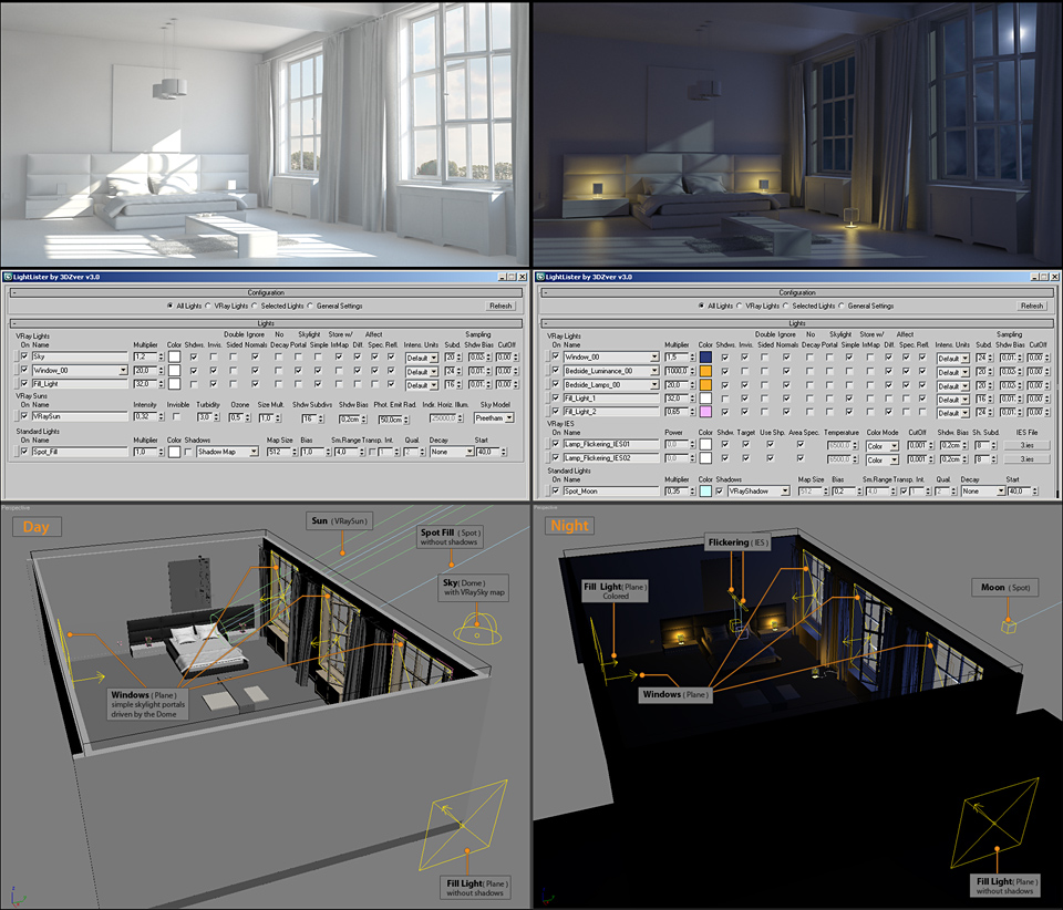
Finally I used a maxscript called Spookylights to create the animation for the flickering of the lights. Parameter wiring was used to control the luminance of the lightbulbs.
3D ANIMATION:
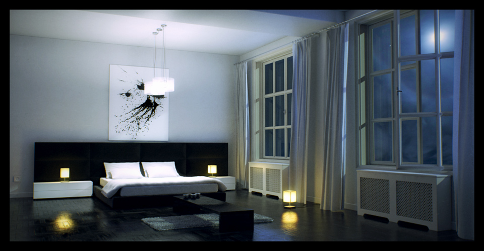
I tired to avoid the usual flythrough animation during any type of architectural visualization. I like to set the emphasis on image composition, realistic camera moves and moving elements. This time the flickering of the lights and the moving curtains played the role of the moving elements which could made the whole animation look a lot less static. Windblown curtains are usual elements in archviz and it's easy to animate them with cloth simulation. For the curtains I used Simcloth (a freeware 3dsmax plugin) and Wind Force to simulate the animation for the low-polygon model of it and then I used that with a Skin Wrap modifier for the high-polygon model. Finally I did some matchmoving/tracking on an HD video to create some camera shake to prevent the unnatural 3D moves of the camera-animation.
RENDERING:
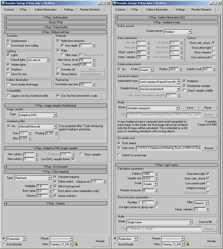
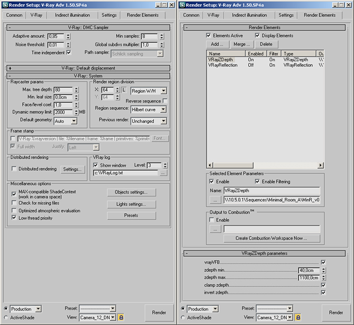
Because of the moving curtains I had to render all the shots in two passes (GI prepass + final pass). In Animation Prepass mode I saved the irradiance map from frame to frame which I used in Render Pass mode when I did the final renders. The prepass also utilized Light Cache that was saved into the Irradiance Map. For the Image Sampler I choose Adaptive DMC with Mitchell-Netravali AA Filter. Usually I use Catmull-Rom for the first testrenders but I found this to be too sharp and aliased for the images. For the final render I only used a Zdepth pass but for the testrenders Lighting and Reflection passes gave me a lot of help to uncover noise and flickering on images.
Color mapping is almost always set to Reinhard mode because that's the best setup to control the Shadows / Midtones / Highlights(Burn) areas of the final image. The goal was to create a Clean/Bleached Render so the Gamma was set to 2.0. With the linear workflow button I utilized degamma all diffuse texures so they did not become bleached at all. Of course I had to manually set a gamma on some of the images with a color correction map. Filter Maps is usually switched off but this needs careful attention because the pixel density should not be too high or too low otherwise it creates spectacular flickering and pixel effects. To make the rendertimes lower for animation reflection/refraction depth values were set from 5 to 2 because rendering glossy reflections takes a lot of computation power.
For Computing the animation I used ten I7 930 machines of and the task assignments was managed by Backburner. The combined rendertime of the 2 passes was between 8 and 60 minutes depending on what proportion of the floor filled the whole image area.
COMPOSITING:
For compositing I used After Effects because it has the best plugins and tools for creating posteffects. Altough I prefer Fusion for images that have more passes because of its nodebased structure.
After loading the sequence I use Depth of Field (Lenscare) and Motion Blur(ReelSmart) effects. Only after this comes the glow and color effects. In this particular image there is almost no DOF because the focus is on everything and it would only blur the whole image. The glow was created by duplicating the render layer and putting on the background in screen mode after using gaussian blur and levels on it. This way I can create a more soft and creamy look than with the glow filter in AE. Color correction was done with Curves and Color Balance. These were followed by the Chromatic Abberation and Vignette effects of the Looks plugin. CA makes the images look blurred so I usually use the Unsharp Mask (radius: 1-2 px) to correct this side-effect. Finally I used a Vignette Texture and a Lens Dust texture to make sure the final composition is not any way sterile.

I hope I could serve anyone who's into architectural visualization or 3D with useful tips and information.
AUTHORS INFO:
Author: David Svantner
site:
AUTHORS INFO:
Author: David Svantner
site:
No comments:
Post a Comment